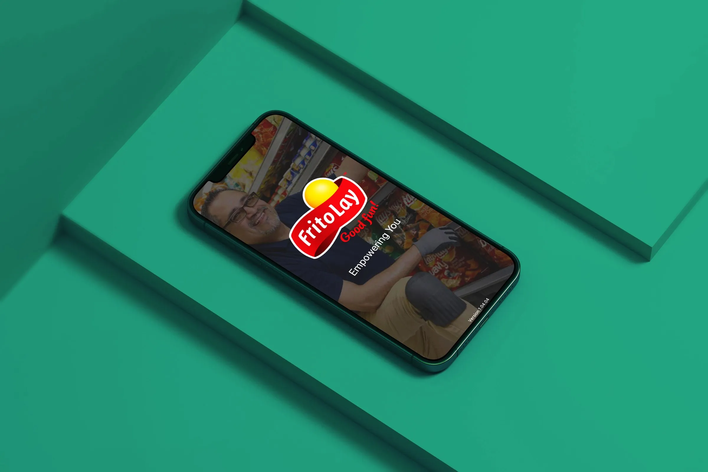
Sales Hub+
A ground-up redesign of Frito-Lay's field sales platform, rebuilding 1,000+ legacy screens into a task-based native iOS experience used daily by 25,000 employees.
- Role
- Senior UX Designer
- Company
- IBM
- Client
- PepsiCo / Frito-Lay
- Platform
- iOS
- 25,000field employees using it daily
- 1,000+legacy screens consolidated
- ~50%fewer screens for core tasks
The Challenge
Frito-Lay's 25,000 Route Sales Representatives ran their entire day of inventory, sales, and delivery tracking on outdated handheld scanners backed by a legacy system of more than 1,000 screens. The workflows were disconnected, the logic was inconsistent, and completing a single delivery meant navigating multiple systems.
PepsiCo committed to a full redesign of the platform at enterprise scale. Then COVID-19 hit, and our entire research operation had to go remote barely after discovery even began. The constraint shaped everything that followed.
Research & Discovery
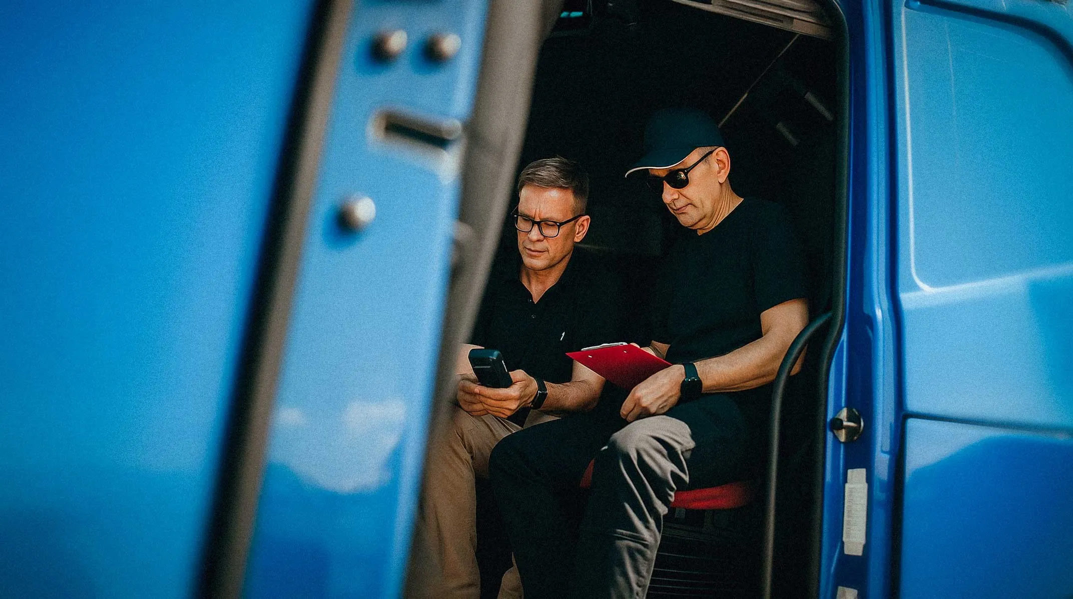
I led remote interviews with RSRs across Plano, Texas and other regions, rebuilding our research plan for COVID-era constraints. Through hands on interviews I found reps had built elaborate workarounds to survive the system's failures. Some kept paper logs alongside their digital entries. Others had memorized screen sequences to bypass functionalities. These weren't power-user shortcuts, they were tactics born from an outdated system.
That insight redirected the entire design strategy. Instead of modernizing the existing screen flow, I pushed to rethink the information architecture from the ground up, consolidating what had been fragmented across multiple back-end systems into unified, task-based workflows.
Mapping the Legacy Experience
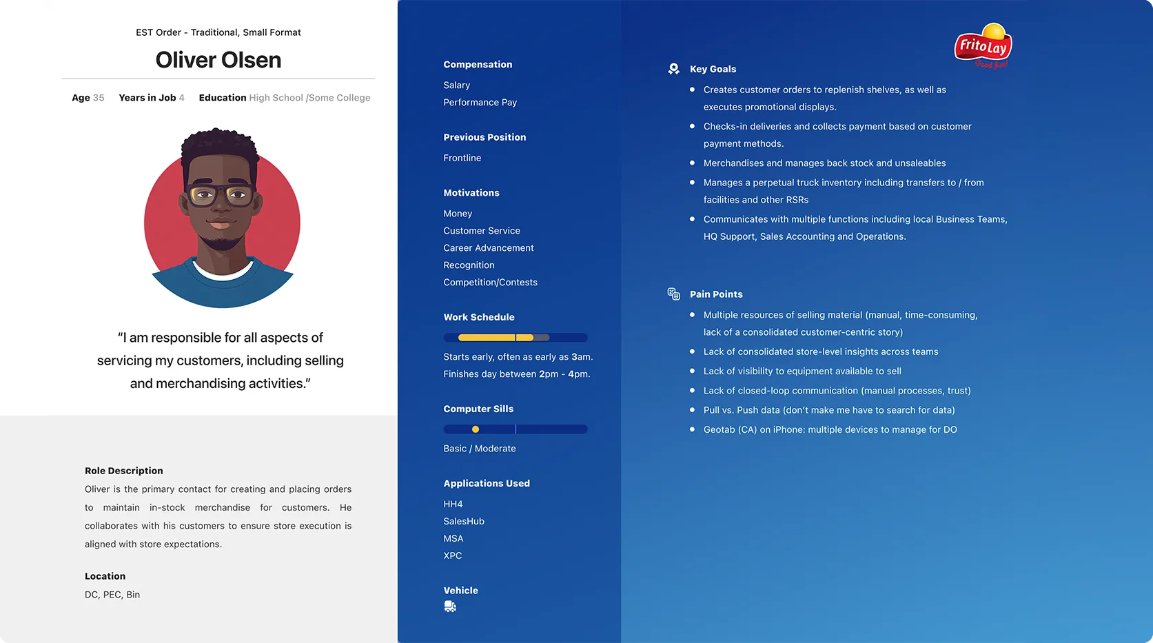
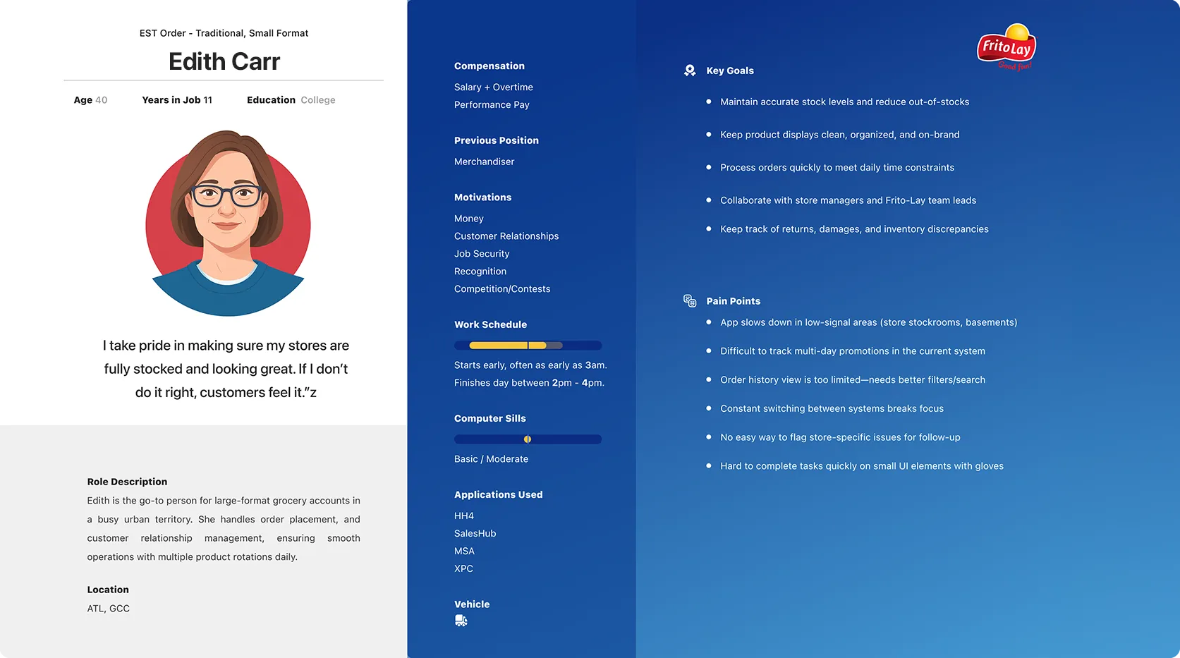
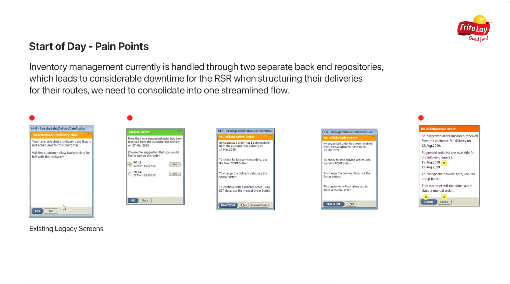
I mapped end-to-end journeys for each persona, tracing how reps moved through their day from check-in to service completion. The mapping exposed some critical friction, inventory management alone was split across two separate back-ends, forcing RSRs to context-switch mid-delivery just to reconcile stock counts. What should have been one workflow required jumping between screens, re-entering data, and mentally tracking across systems.
What I Owned
On a team of five designers, I took sole ownership of the Scheduling and Service Appointment flows, foundational parts of the daily experience that every RSR touched multiple times per shift. That meant designing complete task flows for time tracking, inventory reconciliation, and manager approvals from scratch, not reskinning existing screens.
The hardest problem I solved was the DOT notification system. The legacy app handled expiring vehicle documentation inconsistently: some states triggered alerts, others didn't, and the notification format changed depending on document type. Reps were missing critical compliance deadlines because the system simply couldn't be trusted. I designed a unified, reusable full-screen notification pattern that standardized every edge case and status state into a single predictable interaction.
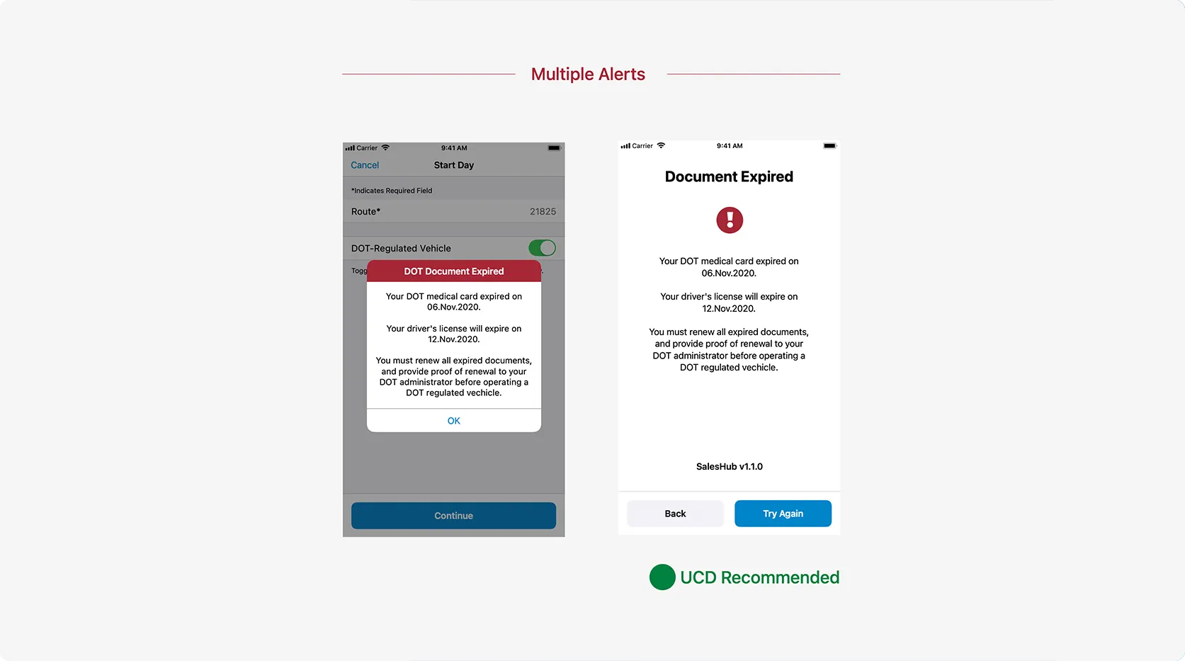
- One full-screen pattern replaced alerts that had varied by document type and by state, so compliance warnings finally behaved the same way everywhere.
- Every edge case and status state renders through the same predictable interaction, with nothing left to inconsistent, per-case behavior.
- Reps stopped missing compliance deadlines: the alert system became something they could rely on instead of double-checking.
- PepsiCo leadership adopted the pattern across all verticals of the application, well beyond the flows I owned.
Iteration & Delivery
I translated each scenario into high-fidelity user flows and prototypes, syncing daily with PepsiCo leadership and cross-functional teams. These weren't rubber-stamp reviews. Stakeholders frequently pushed back on decisions that simplified the UI at the expense of edge-case coverage, and the tension was always "make it simple" versus "make it complete." I learned to present tradeoffs explicitly: here's what we gain in clarity, here's the edge case we'd need to handle differently. That framing kept alignment without watering down the design.
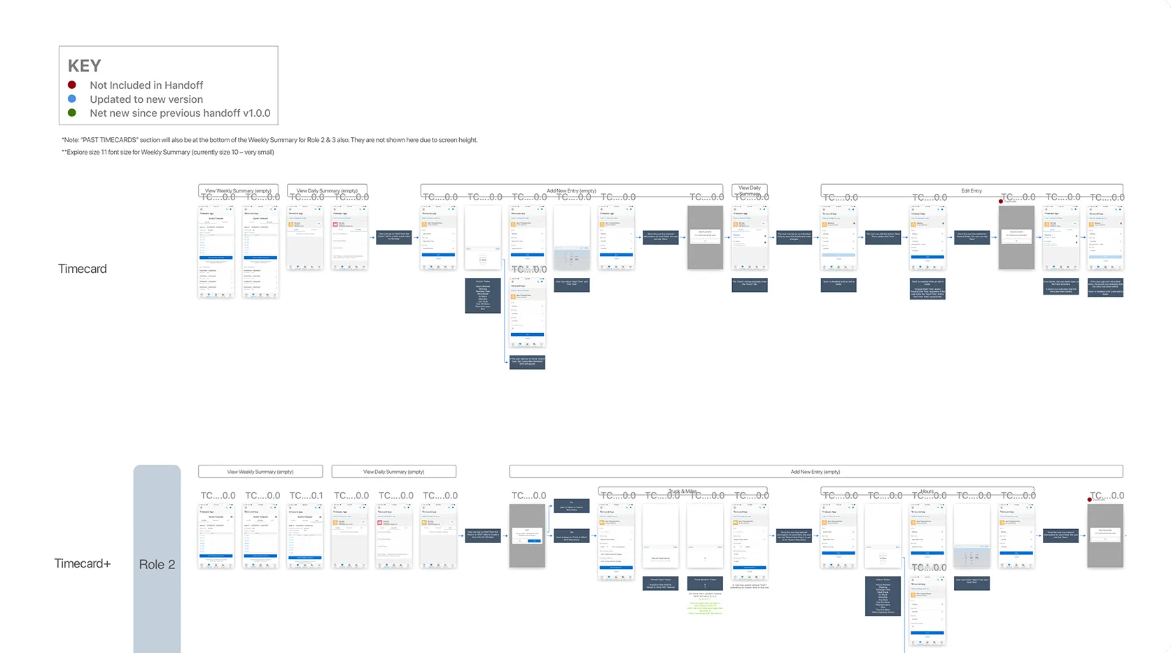
I delivered over a dozen high-fidelity user flows and interactive prototypes across my verticals, each validated against the personas and journey maps from the research phase.
The Outcome
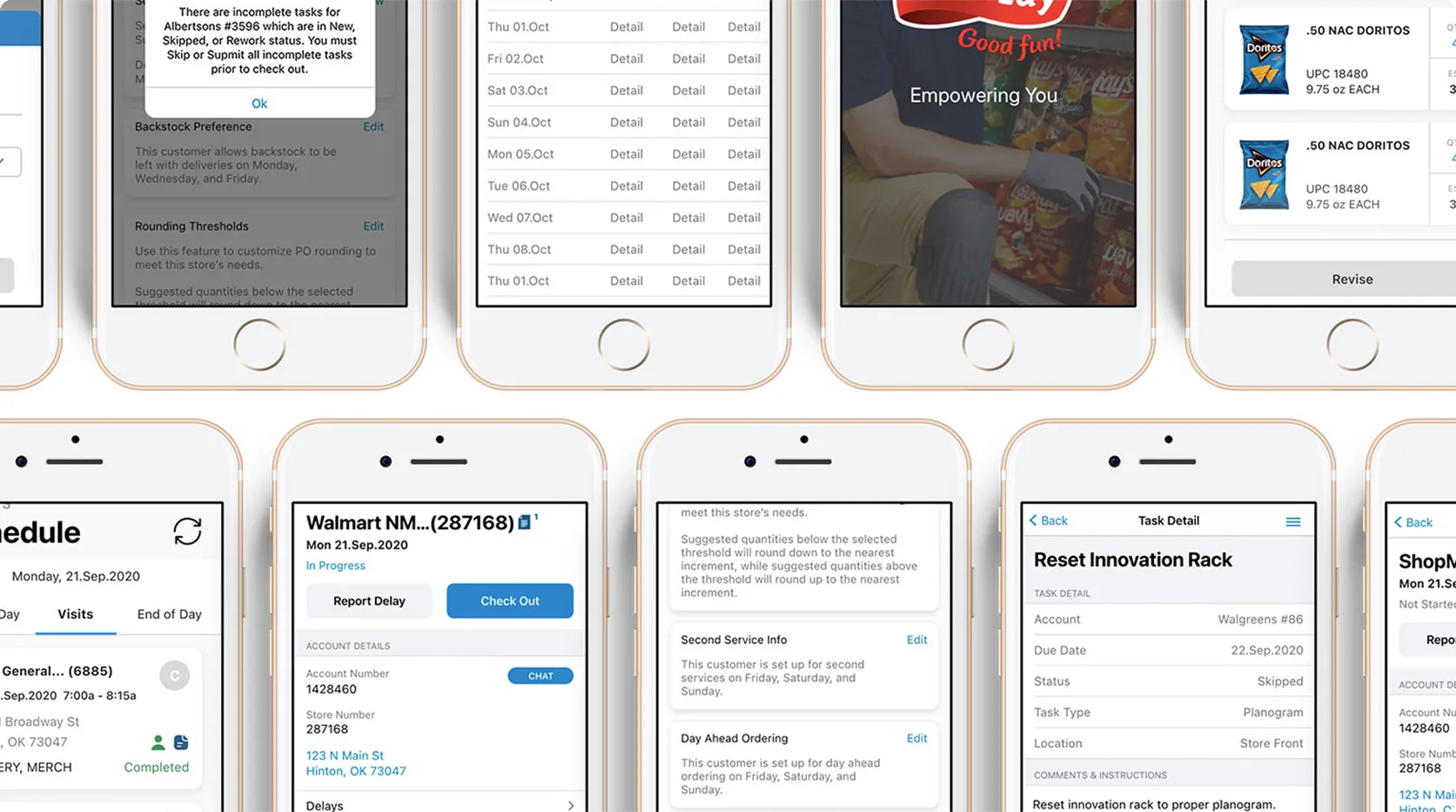
Sales Hub+ shipped to all 25,000 RSRs and replaced the legacy system outright. The redesign consolidated 1,000+ screens into streamlined, task-based workflows, cutting the number of screens reps needed for core tasks like inventory and scheduling roughly in half. The DOT notification pattern eliminated missed compliance deadlines by giving reps one reliable alert system regardless of document type, and the reusable patterns I helped establish reduced design-to-dev handoff time and became the foundation for subsequent feature releases.
What started as a modernization effort became a genuine transformation in how a 25,000-person workforce manages their daily operations, and the work continues to support PepsiCo's digital evolution.
Reflection
Two things from this project permanently changed how I work. First: users' workarounds are the honest requirements document. What people build to survive a system tells you more than what they say about it. Second: the "simple versus complete" tension never resolves itself; naming the tradeoff out loud, with its costs attached, is what actually moves a room. If I ran this project again, I'd fight to supplement the remote sessions with in-person ride-alongs the moment restrictions lifted. There's a layer of context in watching someone work a truck that no video call surfaces.